Burndown Chart: What It Is and How to Use It
August 12, 2026PUBLISHED INAgile
 ali
ali 2026-08-12 15:17:00
 0
0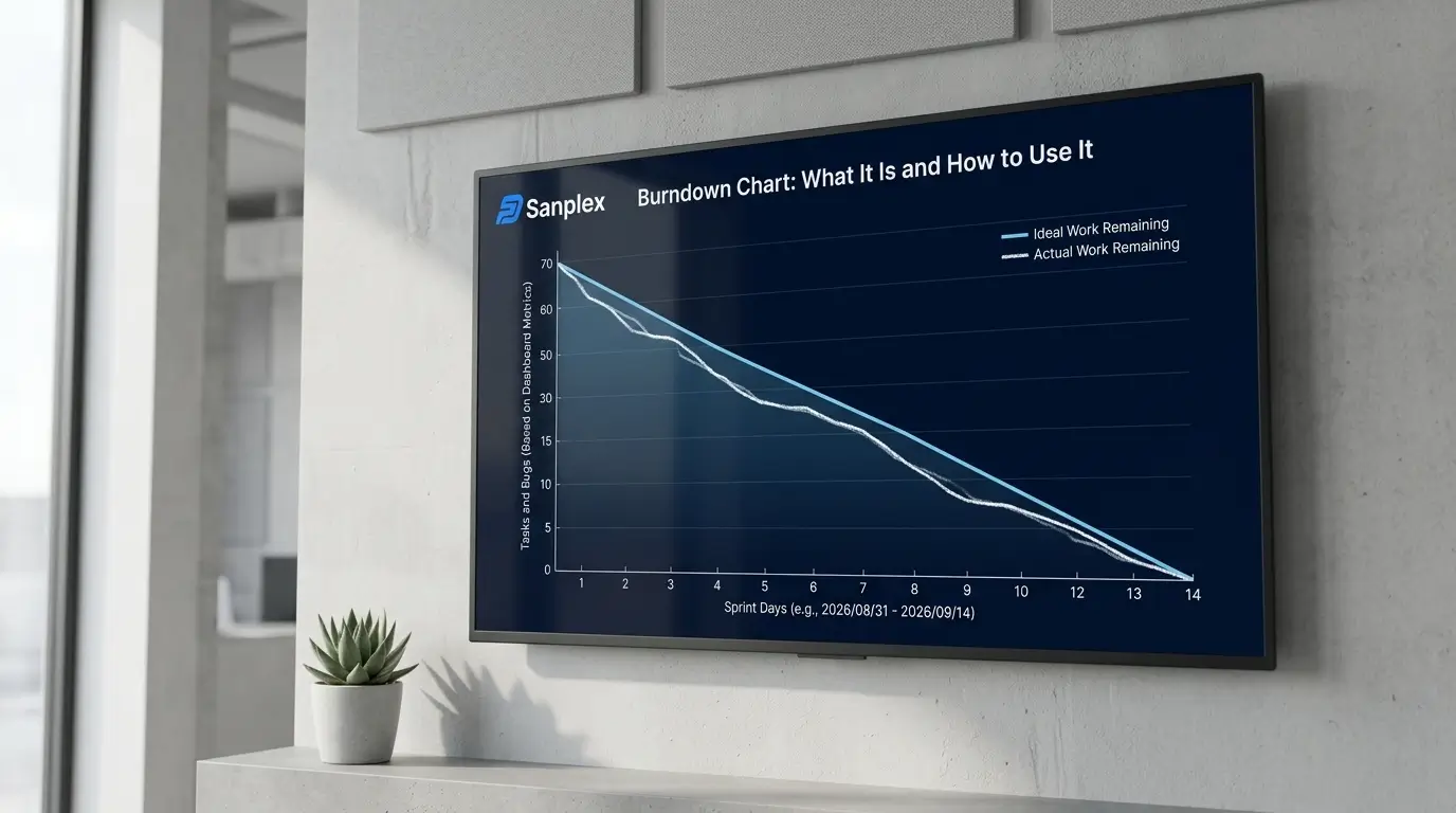
A burndown chart tracks how much work remains in a sprint against how much time is left, plotted as a line dropping from the total scope at the start toward zero by the sprint's end. It's one of the simplest agile reports to build and, somehow, one of the most commonly misread. Understanding what the line is actually telling you matters more than knowing how to generate the chart in the first place.
How a Burndown Chart Is Built
The vertical axis shows remaining work, usually in story points or hours, and the horizontal axis shows the days in the sprint. An ideal line is drawn from the total scope at day one down to zero at the sprint's last day, a straight diagonal representing perfectly even progress. The actual line, plotted daily as work gets completed, rarely matches that ideal line exactly, and that gap is where the useful information actually lives.
Reading the Common Patterns
A line that tracks close to the ideal suggests steady, predictable progress, which is the pattern most teams aim for. A line that stays flat for the first several days before dropping sharply near the end usually points to work being completed in a rush right before the deadline rather than steadily throughout, sometimes fine, often a sign of late-discovered blockers or work that wasn't actually ready when the sprint started. A line that trends upward instead of down means scope was added mid-sprint faster than work was completed, worth investigating whether that was a deliberate, agreed-upon change or scope creep that crept in without anyone noticing.
What a Burndown Chart Doesn't Tell You
It shows how much work remains, not which work, or whether the remaining work is actually the most important part of the sprint. A team could burn down perfectly while quietly deprioritizing the sprint's actual goal in favor of easier tickets. It also doesn't account for quality, a sprint can burn down to zero with everything marked done and still ship work that needs significant rework later. Treat it as one signal among several, not a complete picture of how the sprint is actually going.
Burndown vs Burnup Charts
A burnup chart shows the same underlying data from a different angle, tracking completed work climbing toward total scope, rather than remaining work dropping toward zero. The practical advantage of a burnup chart is that it makes scope changes visible directly, if the total scope line moves, you can see it happened, whereas a burndown chart just shows the effect (a stalled or rising line) without as clearly showing the cause.
Using It as a Mid-Sprint Signal, Not Just a Retrospective Artifact
The real value of a burndown chart is checking it partway through the sprint, not just glancing at it during the retrospective after it's too late to act. If the line is falling noticeably behind the ideal by the midpoint, that's the moment to have a conversation about scope, blockers, or capacity, not the last day. Tools that generate burndown data automatically from sprint activity, rather than requiring manual updates, make that mid-sprint check something a team actually does rather than something that gets skipped because updating it by hand is tedious. Sanplex tracks this as part of its sprint and execution reporting, so the chart reflects real-time progress without separate manual tracking.
Frequently Asked Questions
What should an ideal burndown line look like?
A straight diagonal from total scope at the start of the sprint down to zero at the end, representing perfectly even daily progress. Real burndown lines rarely match this exactly.
Is it bad if the burndown line goes up during a sprint?
Not necessarily, it usually means scope was added mid-sprint. Whether that's a problem depends on whether the addition was a deliberate, agreed-upon decision or unplanned scope creep.
What's the difference between a burndown and a burnup chart?
A burndown chart shows remaining work dropping toward zero. A burnup chart shows completed work climbing toward total scope, and makes scope changes more directly visible.
Can a burndown chart show if the team is doing quality work?
No, it only tracks quantity of work marked complete against time remaining. It says nothing about whether that work meets quality standards or needs rework later.
How often should a team check the burndown chart during a sprint?
Regularly, ideally as part of daily standups, rather than only at the sprint's end, since it's most useful as an early warning signal while there's still time to act.
Want to see real-time burndown tracking connected to your actual sprint work?
Book a demo and bring your current sprint process to the conversation.
Related Blogs
How to Set Up a Product Backlog